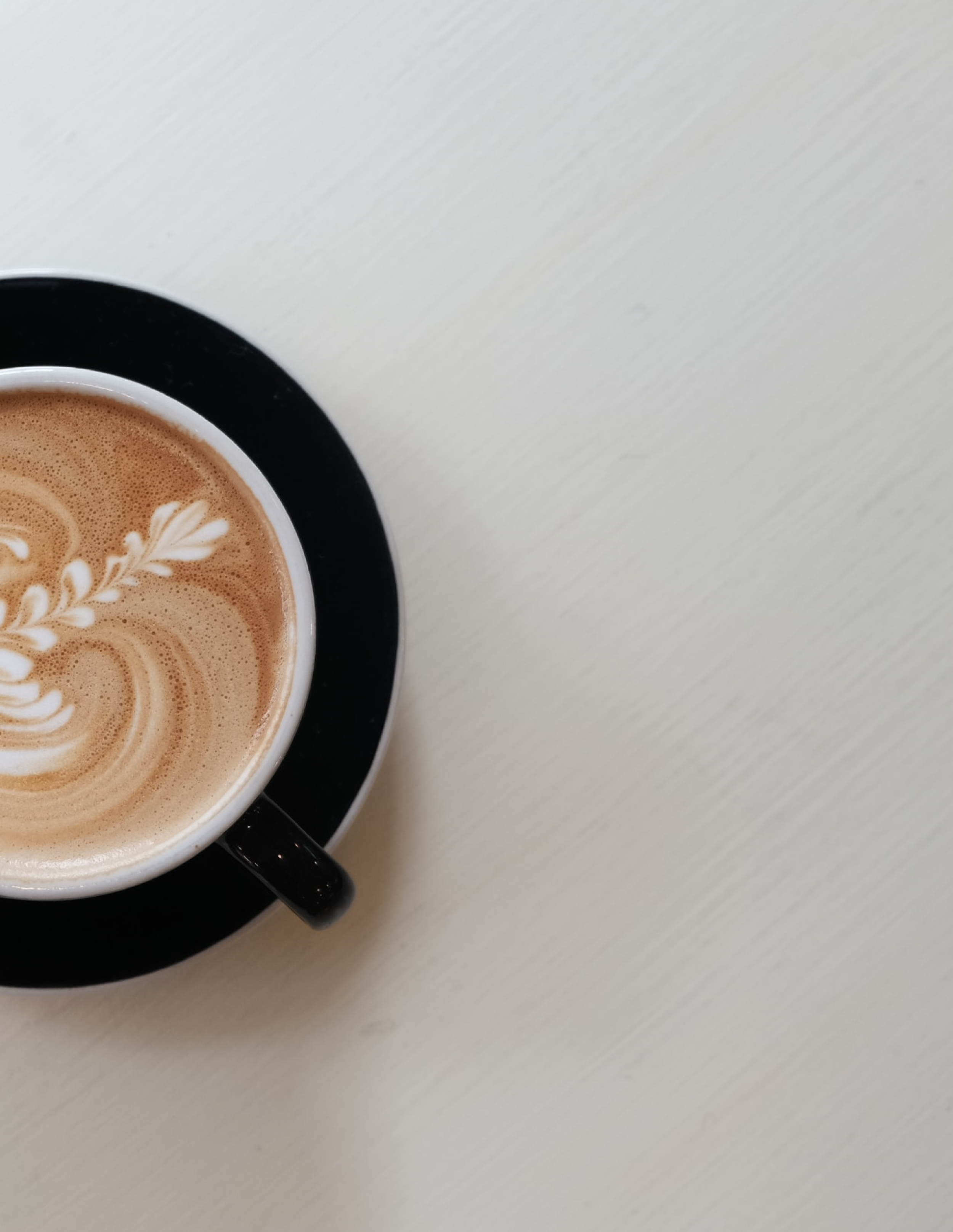
Find the best coffee near you,
for you.

About
It can be tedious to find the best coffee with most restaurant reviews based on food, atmosphere and service. Bean Belt aims to eliminate these problems and help coffee drinkers find exactly what they want.

The Goal
Design a responsive web app (concept) for location-based coffee recommendations. With a focus on coffee rather than other variables, coffee lovers can find the perfect cup by setting personal preferences, reading coffee only reviews and getting directions to coffee vendors in their chosen location.
Duration
8 Weeks - May 2021
My Role
My role in this project was a UX and UI designer. It covered all decisions of the design process from the user research, rapid protoyping, user testing and the finished UI.
Tools
The Process
1. Understand
Competitive analysis, market gaps, user interviews
2. Define
User personas, user flows, wireframes and usability tests
3. Ideation & UI
Moodboards, responsive designs, style guide, and user tests
4. Final Design
Applying the style guide to all screens, finalizing designs and mockups

— Understand —
Competitive Analysis
A competitive analysis of location-based food apps helped identify market gaps and features that would be helpful.
larger location-based food apps cater to restaurants and are food focused
most rely on ratings and reviews to build trust
often include gamification for engagement
Less competitors in niche market
Users Interviews
Conducting user interviews provided qualitative data and revealed the frustrations that users have with current products. It helped to identify patterns and areas of importance.
Synthesis of Interviews
FRUSTRATIONS
1. No menu available, no photos of the coffee shop atmosphere
2. Other sites: filters and search results were irrelevant
3. Shop info (address, phone, hours) isn't easily available
PATTERNS
1. Quality/ratings of coffee and proximity is important
2. Incentives and/or discounts would keep them returning to app
3. Ability to see menus and photos is a feature users would like
NEEDS
1. Get directions easily and quickly to vendor in close proximity
2. Narrow results to find specific coffee/places users want to see
3. See ratings and reviews for coffee shops

— Define —
Hypothesis
Providing filtered search options, user reviews, and ratings for users that have different needs and wants - specific to coffee - will result in usage of the app to find a variety of coffee vendors in various locations. The ease, convenience and ability to narrow results will keep users returning.
MVP Features and Functionality
By synthesizing the data collected from user interviews and I was able to create a list of features based on user patterns and needs. For example, users mentioned when searching for coffee they often get results that are irrelevant - one of the key features is providing multiple filter options to narrow results.

User Personas
As a coffee drinker of only a few years, I couldn’t make any assumptions on what users wanted. Using the information from interviews, I created personas to help keep designs user-centric. “Wanting to know about the atmosphere” of a café from pictures, was one of several insights I couldn’t have assumed.
Jobs To Be Done
Jobs to be Done chart allowed me to identify key features and whether or not these were need or wants - keeping me focused on the MVP. Once complete I was able to use these to create users flows.
User Stories & User Flows
Remembering to always ask “What next” and “Why” helped me to imagine what decisions users might make. User flows helped me visualize steps users take and outlined screens I would need to design.

— Ideate & UI —
Sketched Prototype & Usability Testing
A few Crazy 8s sessions helped me quickly come up with solutions for the design. In Lean UX manner, I began user testing early to find improvements before time was spent creating wireframes. Using paper prototypes for usability testing and was able to uncover areas of opportunity with the the design.
Issues
User testing helped validate features included, but showed that the initial iteration needed improvements with usability and accessibility.

Wireframes

User Testing - Round 2
Having a clear goal and objectives for the user testing provided valuable quantitative data and led to some key design adjustments.
Synthesis of Results
Pages were still cluttered/visually overwhelming
images on search results page are small
Distance info not available on search page
Café Info difficult to see or quickly access
Can’t save item from without several clicks
List of saved cafes weren’t easily accessible
Unable to view multiple locations on map

Moodboards
Creating a moodboard helped define a general direction I wanted the design to go in.
Preference tests showed coffee drinkers identified more with the second board. Testers felt the the first board was too clinical, reminded them of a hospital or work. I created a color palette based on dark, warm, and earthy colors.

Color Palette
I felt a simple gradient with (white to black) with cool greys would contrast nicely with the warm, brown, earthy colors of the imagery. Using a golden color for the accent would help tie all the elements together and unify the design.

Typography

Controls and Text Fields
Icons & Imagery

Responsive Designs
A mobile first approach helped create a clear and practical design that would translate easily to different breakpoints.

— Final Designs —
Collaboration
Before completing my final designs I reached out to other UX Designers to get further feedback on my high-fidelity prototype. They gave me useful feedback that helped me improve branding - small changes using the accent color, adjusting some of the imagery to unify each page.
LOG IN
Log in to write reviews and save favorites.
CAFE DETAILS / SAVE TO / CONFIRM
Quickly get directions, write reviews, or access vendor info easily - menus, contact info, photos. Save favorites to personalized lists or share locations with others.

FILTERS / RESULTS / MAP
Advanced filters allow personalized searches and recommendations.
View vendors using list or map view and get directions easily.

RESPONSIVE DESIGNS
Breakpoints for various devices.
BOOKMARKS
Create personalized bookmarks for different lists.
SUGGESTIVE SEARCH
Auto suggestion for GPS or address search.

Reflection
Synthesize
As ideas begin to flow and user testing sheds light on particular needs and wants, remembering to stick to the synthesis of findings is important. It helped keep designs user-centered and keep the ideations in line with the MVP.
Collaboration and Keeping it Simple
In the ideation phase I struggled with deciding on low-fidelity wireframes and designs that were intuitive. Collaborating and brainstorming with other UX designers helped create solutions.


